

What happened to the NBA's Christmas Day uniforms?
The league is at peak uniform volume, but in the churn of endless branding and marketing we've lost the charm.
Editor’s note: When December hit, I had the idea of doing an oral history of the NBA’s Christmas Day uniforms. I wanted to find some of the people at adidas and the league who were responsible for bringing each iteration to light every year and talk through the process, any weird snags, and the eventual halt when Nike took over the NBA’s uniforms.
Everyone I asked came up blank but did point me in the same direction: Todd Radom. Todd’s a designer, a sports branding professional, and has come up with many team logos and league designs we consider ubiquitous. He also loved the Christmas Day uniforms.
Todd tried to track people down on my behalf, but as we exchanged messages and Todd shared why we’re at the saturation point of peak uniform volume with so few feeling memorable or special, I asked if he’d want to write his thoughts up here instead. He agreed, and I’m so glad he did.
Happy holidays to you and yours, and long live the Christmas Day uniforms.
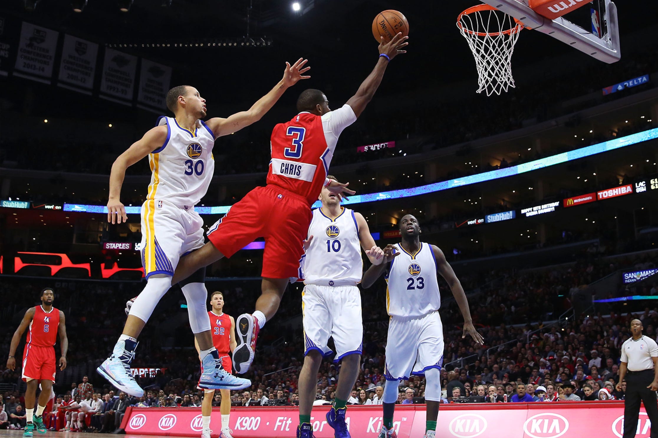
The true spirit of Christmas is, of course, embodied in giving, and for five seasons, from 2012 through 2016, adidas and the NBA gifted us a collection of specially designed Christmas Day uniforms. Some of these were duds — akin to fruitcakes, self-help books, and the like — but the final two sets, from 2015 and 2016, are, for many of us, fondly-remembered holiday treasures.
When it comes to design, less is often more. In the same way that too many notes can spoil a musical composition and too many ingredients can mar a recipe, a little bit of restraint goes a long way in the uniform department.
The 2015/2016 Christmas uniforms were both elegant and understated, inspired by old-fashioned Christmas cards. Each team’s wordmark was rendered in festive script letterforms. The typography was beautifully crafted — no off-the-rack fonts here. Instead, we got bespoke team names that evoked nostalgic warmth, chock full of curlicues and jauntily flared serifs. The lettering ascended skyward — just like Santa’s sleigh.
Player numbers were notched beneath in harmonious fashion, and all of it was lovingly detailed with woven rows of stitching. All embellishments were solid in color and devoid of outlines, which contributed heavily to the overall sense of cleanliness and timelessness. Light colored uniforms and lettering were not snow white (though that would have been slam dunk marketing in this day and age), the hue was instead cream, or off white, evoking the warmth of vintage paper or maybe even that of a sugar cookie.
Can you tell how much I liked these uniforms?
A scarlet wax seal containing the NBA’s Jerry West-inspired league logo completed the look, deployed on the backs of the jerseys below the neckline, and the socks, created and manufactured by Stance, were based on Christmas sweaters. There was room for individual team expression here too — the Golden State Warriors’ shorts contained a bridge pattern, the Orlando Magic’s uniforms had pinstripes, and the Minnesota Timberwolves’ shorts featured their signature trees.
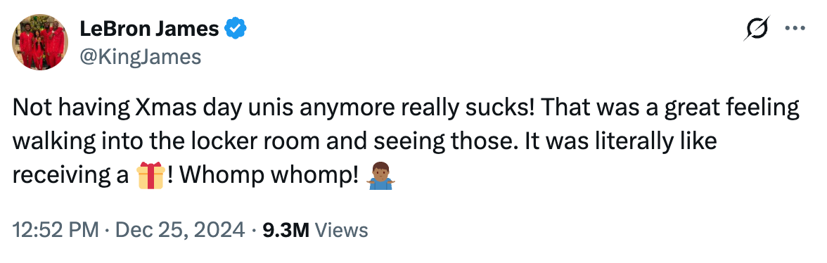
After that… nothing. Nike became the league’s official outfitter in 2017, and Christmas hasn’t been the same since. It’s not just me, either. In 2024, the very face of Nike basketball, LeBron James, posted the following on X:
What happened here? Did we all do something really bad to get on Santa’s naughty list?
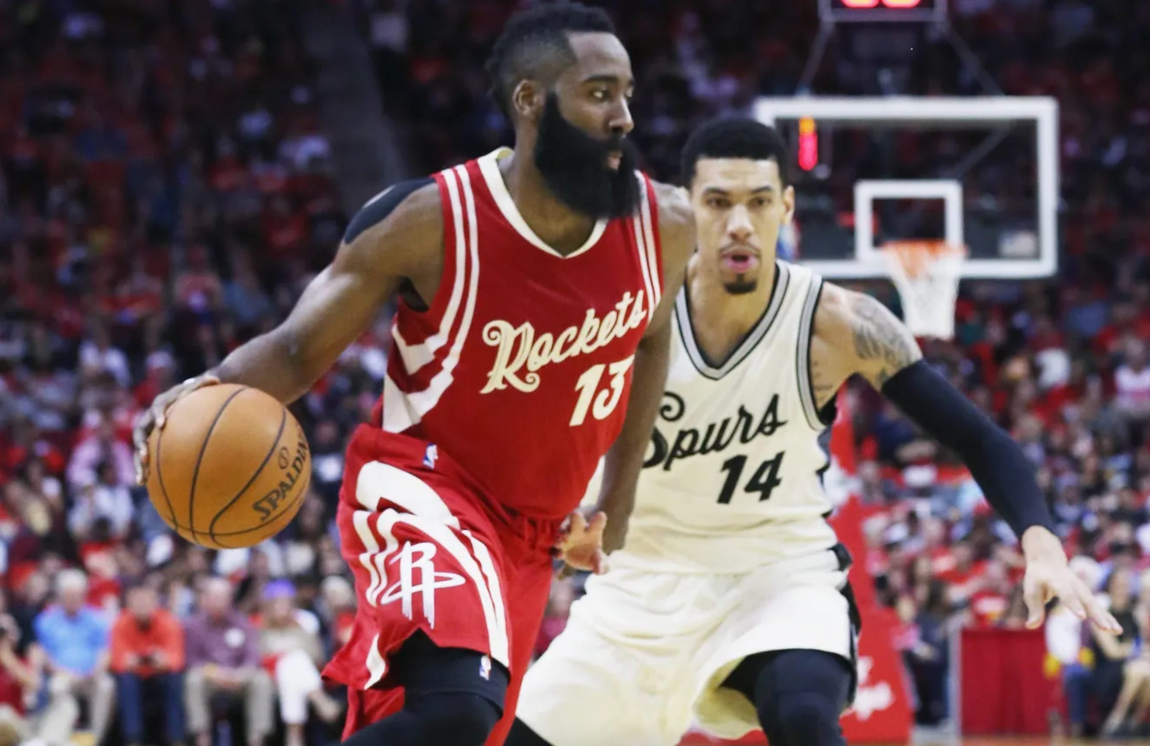
Adidas’ first stab at Christmas uniforms took place in 2012, when they rolled out a set of holiday uniforms that they called “BIG Color.”
These featured what the league termed, “a monochromatic color scheme with solid color team logos, names, and numbers framed with minimal accent color and a shimmer finish for a bold statement.” They were roundly criticized for their lack of legibility.
The following season adidas came back with “BIG Logo” uniforms, which included sleeves. Huge team logos were featured, in reflective chrome. Players griped about the sleeves, fans weren’t happy about the overall look, and it was back to square one in 2014. Sleeves were now out, and while team logos were featured on the fronts again, this time they were much modestly proportioned and rendered in team colors, and paired with player numbers. Finally, players’ first names were spelt out on the backs of the uniforms, “a nod to [the players] familiarity and popularity with the NBA fan base around the world,” according to adidas.
2017’s new, eight-year $1 billion NBA/Nike global partnership upended seven decades of tradition. Home and road uniforms are now history, having been replaced by City, Association, Icon, Classic, and Statement Editions. Along the way we’ve seen some winners, including the Warriors’ expressive homage to the Bay Area’s Chinese culture, the Hawks’ Martin Luther King tribute look, and the Nets’ subtle nod to all things Biggie Smalls and Coogi. We’ve also gotten some teams with airport designations — CLT, ORL, and PDX come to mind. The Denver Nuggets have been transformed into Team 5280, and the Heat have taken the court in jerseys that touted “Heat Culture.” The Spurs have trotted out there in light blue uniforms, the Pistons have worn green, the Bucks have sported blue and yellow, and a bunch of teams have outfitted themselves in neutral blacks and grays.
We get the kitchen sink, but we get coal in our Christmas stockings, year after year after year. Bah, humbug.
All of this uniform churn most certainly reflects the state of our collectively diminished attention spans, and, as if all of this wasn’t enough, we get different court designs too! Each and every night, the NBA puts on a display of the continual push and pull of branding — which is all about establishing and cementing consistent visual impressions — and marketing, whose main goal is to sell stuff. At its best, branding and marketing not only co-exist, they thrive together, unified in mission, but here, more often than not, we see short term goals eroding long term goals.
Selling more jerseys is great, but what happens when a fan can’t tell which two teams are playing in any given game? Does it matter if a kid who’s just discovering the sport sees the Sixers in five different uniforms? None of which Joel Embiid is actually playing in, but I digress.
At the risk of being that kind of “get off my lawn guy,” I’ll say it — it’s way too much. An alternate uniform that taps into the history of a team or embraces some community touchpoint is great, but too much is definitely too much, a short term sugar rush that may taste great, but probably isn’t ultimately good for us (“Sugar Rush™” could well be Nike’s next big NBA marketing initiative).
Trends come and go, but there’s something really valuable and special about the fact that the Celtics are eternally a green team, the Lakers are gold and purple, and the Knicks wear the official colors of the city of New York, blue and orange. San Antonio is black and silver, the Bulls are red and black, and Phoenix looks great in purple and orange. There should be room for expression over the course of a long season, but that should ideally be balanced with long term objectives.
Santa (or Adam Silver): Please reduce the churn and restore our Christmas Day uniforms. And Nike, if you are listening, look to 2015 and 2016 for inspiration. And no airport codes, please, because that’s the last thing anybody wants to deal with on Christmas Day.
 | A guest post by
|