A predictive rating of every NBA City Edition hat
Writer and critic for The New Republic rates this year's crop of New Era caps.
I love hats, and I love basketball. That’s why I’m so grateful for the City Edition.
In 2017, Nike introduced the City Edition as a series of alternate uniform concepts. Most of these uniforms diverge refreshingly from the team’s core aesthetic, and they’re supposed to represent some meaningful connection to the city or region. Some of these look transcendently awesome; some of them look indescribably dumb.
But, every year, New Era Cap launches a new line of corresponding NBA City Edition hats, with just as transcendent a ceiling and just as dumb a floor as the jerseys. I await these drops like Christmas morning.
And so, as Basketball Feelings’ self-appointed visiting Hat Critic, I hereby offer these capsule reviews of every single New Era NBA City Edition cap for the 2025-26 league year, along with some brief, horoscope-like speculations about what these designs portend for the teams whose fans will wear them.
ATLANTA HAWKS
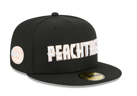
I look at this hat, and I feel nothing. But imagine if they made the whole hat that sweet sweet peach color that’s outlining the wordmark. Such a hat would make me feel many things: joy, for instance. We’re all waiting to fall in love with you, Hawks, if only you’ll let us.
BOSTON CELTICS
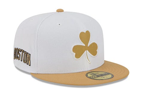
This hat is gold, apparently, because it represents Boston’s “timeless tradition of winning.” Winning? Your tradition is winning? Well, my tradition is rolling my eyes and theatrically sighing. On-brand hubris, though, for a team that’ll be good enough to avoid the lottery but not good enough to win in the playoffs.
BROOKLYN NETS
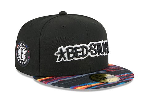
Nets core uniforms have all the visual dynamism of an “SNL Digital Short” title card, but their City Editions highlighting local artists like Biggie are always solid. The Nets, too, should focus on their homegrown talent. Trade MPJ and get that young locker room some vets who won’t make all their team meetings sound like Andrew Tate podcasts.
CHARLOTTE HORNETS
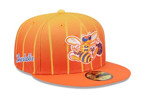
Pinstripes on a hat almost never work. So, credit to the Hornets for having theirs disappear two-thirds of the way up the crown. This hat, like the Charlotte Hornets, represents some good decisions, some bad decisions, some unforgivable decisions. And all of them too smushed together to see what a coherent version might look like.
CHICAGO BULLS
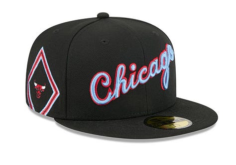
I think the disproportionately large side-panel design unbalances what’s otherwise an appealingly clean hat. That said, who am I to question the Bulls’ decision-making? I wouldn’t have made these design choices, but I also wouldn’t have bet on franchise player(?) Josh Giddey, so what the fuck do I know?
CLEVELAND CAVALIERS
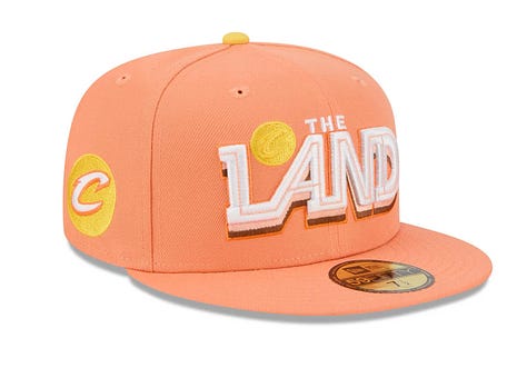
The press release says the circus-peanut orange represents the “hues of Cleveland’s sunsets and fall foliage.” I love that they’re highlighting the unique, regional idiosyncrasy that Ohio has sunsets and also deciduous forests. Though I do like this hat. When’s the last time you watched the sun go down over the horizon? When’s the last time you really appreciated Donovan Mitchell?


DALLAS MAVERICKS
This looks like an Imagine Dragons album to me. Or maybe one of those tight long-sleeve tees that’s supposed to look like tattoos. Apparently, those are the wings of a Pegasus on the side. You know what would look cooler than thick curls of royal blue vape smoke on this hat? An actual fucking Pegasus. This hat, like the Mavs organization, is prioritizing the wrong elements. You got a Pegasus, man. Let him fly!
DENVER NUGGETS
The Nuggets’ original Mutumbo-era rainbow skyline logo should be installed as stained glass windows in the Ball Arena. It’s a logo so legendarily good that even this pixelated modernization is a God-Mode hat design. I think I’d prefer if the hat were blue, but, when you’ve got something that special at the center, it doesn’t really matter what you put around him. Around it. I’m speaking metaphorically about Nikola Jokic.
DETROIT PISTONS
Again with these side-panels! I don’t know what to do here. I don’t like the cartoon lightning bolt creeping up the side of my head, but, without it, there’s nothing else to look at. The Pistons, finally, are a team that knows who they are; this hat doesn’t.


GOLDEN STATE WARRIORS
The Town. The Town is Brown. On the Crown, the Town is Brown. The Warriors left (betrayed?) Oakland in 2019, having won three of their four Curry Dynasty championships there. They won once more in the bosom of the Silicon Valley tech overlords, but the empire is now in decline. So it makes sense that they’d return to this Oakland-centric design to take one last run at glory. Disingenuous or not, this hat is hard as hell.
HOUSTON ROCKETS
A dunking astronaut? A DUNKSTRONAUT? Well, you might ask, isn’t the Dunkstronaut just the Rockets’ mascot? No, he isn’t! Their mascot is somebody called Clutch the Rocket Bear. The Dunkstronaut is a whole different little guy who is exclusive to their uniform branding. What if, instead of trying to colonize Mars, we just looked up to the stars and posterized them? It’s a new era in H-town. Amen.
INDIANA PACERS
Indianapolis is a basketball city once more, anchored by Caitlin Clark and Tyrese Haliburton — two of the most virtuosic and annoying young stars in their respective leagues — and this loud, unmissable hat reflects that revived spirit of Reggie Milleresque exasperating dominance.


LOS ANGELES CLIPPERS
This big logo is great as a contrast to the Clips’ recent rebrand, which has all the panache of a Canva template for a nautical themed birthday party invitation. The speed and youthfulness of this hat is something for the aging Clippers to Aspire to.
LOS ANGELES LAKERS
I don’t like hat designs that are overly reliant on the way the jersey is designed. This pyramid-shaped word-mark makes perfect sense on a jersey, with the player’s number nestled in the central chamber. On a hat, there’s a void in the middle. A big void in the middle.
MEMPHIS GRIZZLIES
This Stax-inspired look is the Platonic ideal of the City Edition collection — locally meaningful, globally recognizable, and the tightest font imaginable. But the front panel of this hat is unbalanced. The word-mark should be alone on there, with the Isaac Hayes stripe cleverly incorporated elsewhere on the crown. Like the Grizz, this hat has exciting individual elements, there’s just something a little off about how they’re currently arranged.


MIAMI HEAT
Miami “Vice” is the transcendent masterpiece of the City Edition collection. It’s puzzling to me why the team haven’t made this their core uniform. Perhaps the Heat’s Culture Czar feels it’s too decadent to fully endorse. The wordmark pops in any arrangement of the pink/teal/black colorway. Much as I hate to admit it, the Heat always find a way to make it work.
MILWAUKEE BUCKS
This is part of Milwaukee’s “Cream City” line, which is a concept that doesn’t make more sense once it’s been explained to you. This “M” looks like it belongs on the chest of an off-brand superhero. And they’ve already got a brand name superhero playing for them.
MINNESOTA TIMBERWOLVES
Anthony Edwards is, by a country mile, the coolest current NBA player, and the Wolves, during his tenure, have largely done a good job of matching his personal swag with excellence in City Edition design. That’s especially true of these Prince-inspired hats. In twenty years, all the Getty Images of Ant doing insanely awesome shit are going to feature him and his fans dressed accordingly.


NEW ORLEANS PELICANS
Man, I love when the Pels get spooooky. That menacing, devil-eyed pelican’s got bones dripping in ectoplasm! He looks like he just flew out of the transformation sequence in The Princess and the Frog. The thematic connection here is that the 2025-2026 New Orleans Pelicans — and their fans — are in Hell.
NEW YORK KNICKS
Here we have that New York City Exceptionalist magic where we all have to agree that this Knicks hat, that looks like basically every other Knicks hat ever made, is also the result of a deeply team-specific and meaningful collab with fashion and lifestyle brand Kith. O rly?
OKLAHOMA CITY THUNDER
When Clay Bennett bought the Seattle Supersonics, he visited a witch who granted him his wish to move the team and build a potential dynasty in Oklahoma. What Bennett didn’t realize was that, in exchange, his team would be cursed to always look like shit playing in the most ill-conceived, aesthetically incoherent uniforms in the league. This busy hat, which pays tribute to OK’s indigenous tribes, is about as good as it gets.


ORLANDO MAGIC
The Magic have struggled on offense this year, but, credit to them: this is an offensive hat. And it’s offensive, in part, because it befouls the legendary wordmark of Shaq and Lil’ Penny with a brim that looks like it’s a plastic shopping bag from the Disney Store.
PHILADELPHIA 76ERS
This hat is boring, ok? But my feeling, as a fan, is: who cares? Elsewhere on neweracap dot com, you can purchase a hat based on the Sixers’ 2025-2026 Hardwood Classic uniform, which features the Iverson-era wordmark that is among the best and toughest logos in all of sports history. So what I’m saying is, if the Hardwood Classics hat is playing at an MVP level, maybe all we need from the City Edition hat is 19-7-5 in 25 minutes a night with no back-to-backs? Right? RIGHT?!
PHOENIX SUNS
I’m calling this the “Black Hole Suns” hat. This hat feels like the point you reach in a game of Sim City, where you look at the irredeemable mess you’ve built and you go, “you know what, I’ve ruined it, I’m going to clear the board and start over,” and then you have a Godzilla destroy the city.


PORTLAND TRAILBLAZERS
Apparently, the teal carpet pattern is based on the PDX airport runway? I’ll take their word for it. To me, it has a chic kind of Trapper Keeper feel to it, possibly appealing to recently resurrected Millennial king Jrue Holiday. I absolutely love this for them.
SACRAMENTO KINGS
This side-panel design is supposed to represent “The Beam,” but it looks like the sutured flesh of Guillermo Del Toro’s hot Frankenstein monster. Anyway, the Kings won’t be lighting that beam all that often this year.
SAN ANTONIO SPURS
Must the Spurs have everything? A perfect hat, the sharpest jerseys in the league, PLUS one of the Signs aliens who plays like Pistol Pete crossed with Dr. Octopus. The big chunky spur looks great, the “fiesta” stripe makes it pop off the panel, smiling through it all, can’t believe this my life.


TORONTO RAPTORS
I love the Vince Carter dino, but sapping this design of its signature purple just makes it look like one of my daughter’s partially filled-in coloring book pages. There’s just not enough there yet.
UTAH JAZZ
This is a variation of the gorgeous red-yellow-orange gradient City Editions from the Mitchell-Gobert era. Now, imagine that a vampire swept into Utah and drained that design of all of its vital life-force, leaving but a wan, bloodless husk. Salt Lake City’s personal Count Orlok is Danny Ainge, and he has sucked all of the joy from the Utah Jazz organization like a Mormon Nosferatu. Lauri Markkanen and Ace Bailey are trapped in his castle against their will. Walker Kessler is dead. Danny Ainge is an appetite — for the number one pick in the 2026 draft — nothing more.
WASHINGTON WIZARDS
Apparently, there’s a designer in Washington DC who’s capable of using gold in a way that doesn’t make it look like Liberace staging a military coup. I prefer the DMV wizard on the side panel to the logo on the front, but, all the same, at least there’s something to be optimistic about in our nation’s capital.